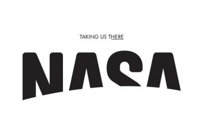
Proposal for NASA’s new logo.
Like most of you, I truly enjoy a good re-brand, specially if it’s full of gravitational pull charts á la Pepsi :/ Not. Base recently redesigned NASA’s logo for a feature in The Future Laboratory’s Viewpoint magazine and I personally believe it works wonderfully. The contrast of technology a name like NASA provides, combined with a friendly, modern and clean approach is executed well. Plus, it opens up the brand to a global audience by ditching the U, S and A cliché colors, which I think is always good.
From their site…
‘If you could redesign any brand, which would it be? This was the question asked us recently by View

point magazine, The Future Laboratory’s bi-annual magazine about trends, brands, futures, and market strategies. Hmmm, we thought. What company or organization is doing super-cool, interesting, worthwhile things, and is completely undersold by its logo or brand? Within minutes we were in unanimous agreement on our subject for this project: NASA.

point magazine, The Future Laboratory’s bi-annual magazine about trends, brands, futures, and market strategies. Hmmm, we thought. What company or organization is doing super-cool, interesting, worthwhile things, and is completely undersold by its logo or brand? Within minutes we were in unanimous agreement on our subject for this project: NASA.

NASA’s aptly nicknamed meatball logo
As part of our proposals for NASA, Viewpoint asked us a few questions about the project:
Question: What made you choose NASA over any other household name/brand?
Base: For starters, we didn’t want to choose a subject for this redesign based only on their having a bad logo; of course everyone wants to work with clients who are doing cool and interesting things. So that immediately narrowed it down a lot. And yes, we also wanted to find an organization that we could do great work for. One of our art directors suggested NASA, and the agreement was unanimous.
Question: How did you kick it all off? What was your starting point?
Base: We opened it up to everyone at Base and had a variety of input from across our five offices. At the beginning of a project we try always to stay open to any and every idea, though those preliminary ideas usually end up being doors to other, better ones. Our starting point was to have no starting point, zero gravity!


Question: Please tell us a bit about your research phase.
Base: We had a number of people involved in this, from Brussels, New York, and Madrid. Some early references and sketches were based on “up.” We tried out vertical logos, images of people looking upward… And as a reference, we loved the Pioneer plaques, the pictorial summations of human life and earth that were sent aboard the Pioneer 10 and 11 in the early ’70s, sort of as dog collars, in case these ships were intercepted by extraterrestrial beings.Of course space photography was going to be something to investigate because there are so many beautiful and awe-inspiring images. But the other edge of that sword is that NASA already has such strong imagery associated with it. Then for some of our options, the images seemed too tied to the idea of American power. What saved us was getting back to the essence of NASA, which is not about technology or politics but a dream.
Question: You talk a bit about “de-emphasizing” and “downplaying” NASA in your treatments. Do you think this approach is more important in today’s branding?
Base: There are always nuances and interplay between each of the elements you’re working with. We at Base always think about it as a mixing board—you have typography, color, writing, imagery, a grid, etc.… each with its own sliding level. And in finding the right balance or mix between these things, some are turned up, others down. Because if you scream everything at the same time, no one will listen. But more than simply a balance, you try to use each of these elements in light of the characteristics you’re trying to bring out in and through the others. To play these elements off each other, so they collectively add up to more than their sum.
Certainly today there is a trend today toward work that is deeper, more considered, and more substantive than simply slapping a static logo on everything. And it has to be more layered than simply design. If given the chance to further develop our ideas for NASA—which would be a dream, by the way—we would of course go deeper than what’s here, to better reflect the organization’s architecture, missions, research projects, and what it wants to say about itself.


Question: What key influence do you hope your NASA work would have on other designers?
Base: We would hope that people see this project and understand it. This is something we always strive for at Base, to be self-evident, to get to the essence of something as simply and clearly and immediately as possilble.

Question: What do you feel is NASA’s core DNA?
Base: Exploration and discovery. But the context of this has changed with time. At the beginning, it was linked with the army; it was about competition and power. But now there’s the ISS, and it’s a new era. Different nationalities are working together in space.
Question: Who are you aiming to resonate with? A new generation? Existing fans? Others?
Base: Everyone! Part of the reason we chose to work on NASA is because what they do is so fascinating no matter who you are, where you live, how old you are. Space is infinitely interesting; the more we know, the more we want to know. So we made an effort to capitalize on that, to bring people in and invite them where NASA is going….

Thanks to Diego G and the good people at BASE for the Q&A session.
No comments:
Post a Comment